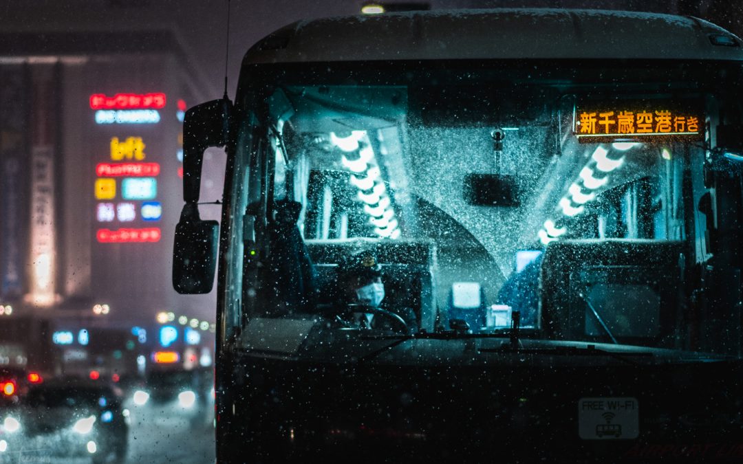
I often get asked about my editing techniques, particularly for my night photos. In this article, I will briefly explain how I edit my nighttime street photography using Adobe Lightroom.
Before you start, you should ensure you’re shooting in the optimal way, meaning capturing RAW files that have preserved highlights at workable ISOs. Read my night photography shooting guide for more information on the subject.
If you’d prefer to watch, I’ve embedded some videos from my youtube channel:
Color grading night photos
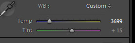
There’s a couple of different methods you can use to achieve a certain color on an image. My preferred method is simply by using the temperature section on lightroom. This is same as adjusting your white balance, whether it is in-camera or in post.
The other methods would be using the color curves, or the split toning method. Color curves are a complicated method to achieve what I feel is mostly the same thing. Split tone color grades can look fake, but I sometimes use them in moderation for photos that are difficult to color grade with WB only.
I like to go for a colder white balance, achieving a blue look. Tint towards greens for cyan or purple towards… purple.
Once I have a decent blue-ish tone, it’s time for HSL to fine tune each individual color. Side-note: It’s easy to overdo colors and saturation – be careful of overprocessing!
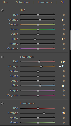
The HSL tool stands for Hue Saturation Luminance on Lightroom. Hue helps you adjust individual colors hues, typically I like to look for contrasting colors here and make them opposite of each other, or just generally correct things like skin tones.
Saturation is self explanatory. Warm colors are a good contrast for the blue, so I usually bump those up by a bit. I try to usually compensate this by decreasing the overall saturation when needed, if the photo looks oversaturated as a result. Moderation is key.
Luminance can help make individual colors highlight more, or it can flatten them. In portraits, it’s useful for skin tones. In urban night photography, I usually use it to make certain colors glow, adding contrast to certain areas of the image. The use of luminance is very situational, so play around with it to find the sweet spot.
Editing night photos
Before you start editing, it’s good to make sure your screen’s color settings are somewhat correct. If you’re using a Samsung phone for example, it will have a boosted oversaturated colorprofile enabled by default, you should disable that to get the correct colors. If you use a Mac or an iPhone, those usually have great colors by default. If you’re using a random windows laptop or monitor, like I am, then the best thing you could do is buying an external color calibration device to ensure your colors are right. Otherwise, you may be editing blind. I mention this, because I learned it the hard way – for the first 2 years of my photo “career”, my edits were all over the place due to my completely messed up laptop screen. Here’s a link of the color calibration device I use.
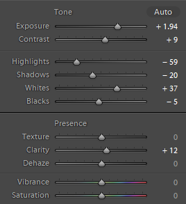
Exposure is quite self explanatory, usually it’s the first thing I fix. Make sure you’re editing at full brightness before starting, otherwise it’s easy to misjudge the exposure.
Usually I prefer to use Curves for Contrast, but in the above example I’ve further bumped up contrast by using the slider. Ultimately, it doesn’t really matter.
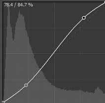
An S curve is a good way to adjust contrast. Raising the black point at the right side will give your shadows a nice fade, also known as crushed blacks look that used to be very famous on Instagram until it was overdone. I still use it in moderation.
Highlights can be pulled down for a nice HDR look, sometimes they look better blown out though. You can pull down highlights and use Whites to pull the lost contrast back into the image.
Clarity looks good for wet ground, decreased clarity works well as spot edits for neon lights. With clarity, remember not to overdo it again.
Dehaze can be used to clear out fog, but sometimes decreasing it also works wonders. My Urban Night preset uses a combination of decreased dehazing and an S curve to create an unique look for the signature preset- more details here.
Texture is a newly added feature to Lightroom. Sometimes increased texture with decreased clarity can work wonders – play around with it.
I like silhouettes for many of my photos, so I often turn shadows down. Many also like to pull them up for that HDR look.
Vignetting usually works quite well for night photos that are already dark. You can make it subtler by using max Feathering.
I wouldn’t recommend increasing Saturation or Vibrance, because with increased contrast and HSL tuning your photo will already be colorful enough. Overdoing saturation is one of the easiest mistakes to make as a newbie. Instead, it’s better to leave them be or decrease them by a bit.
More Night Photo Editing Resources
I think the above covers most of the basics, and of course practice is the most important part. It will take some time to get good at color grading especially, and the longer you do it, the better you get. Both skill-wise and internally.
For more resources:
- check out Teemusphoto on Youtube for more editing tutorials and videos.
- see my night photography presets here (free and paid versions available)
- You can also follow me on Instagram and Twitter to stay up to date & in touch.